Neon colors have been around, making clothing pop ever since it became a design staple in the 1980s. Today’s creators use these loud colors to attract the eyes of viewers and give designs the vibe of summer and nightlife.
The power of neon colors to immediately get attention made it one of the most important colors for constructions, signages, and business running.
Where did neon colors come from?
In the 1930s, a teenager from Ohio suffered an accident and got stuck at home to recover inside a dark bedroom. Out of boredom, the Ohio teenager, with the name of Bob Switzer, decided to play around with fluorescent minerals by waving them in the air. This inspired his succeeding experiments with mixing varnish for wood and the glowing minerals.
Switzer named the resulting product Day-Glo. The fluorescent coloring was later used to make high-visibility jackets used by the Second World War’s American soldiers. Today, Day-Glo is a corporation holding the throne as the world’s largest manufacturer of daylight fluorescent pigments.
Even though neon hues did not get the attention they need from fashion until the 1980s era of boldness in fashion when it comes to colors, it has become a staple for use in other ways that require awareness from viewers.
What is the meaning behind these glowing colors?
Neon colors take the psychological traits ingrained in the colors related to them. Electric blue gives the feeling of calmness and tranquility, the same feelings provided by its base. Neon pink goes after the playfulness and fun that its base pink gives off.
As neon colors are glowed-up versions of their primary color bases, the fact that neon colors with brightness ramped up can distort and change their traits. An example of this being pure green’s neon version—neon green. Pure green has long been associated with the environment and growth. But artificial neon greens strip the said meaning away. Instead, neon green provides the feeling of digitality and a Matrix-like vibe.
The brightness, brashness, and artificiality of neon colors are not always symbols of excellent taste. The established chicness in muted and neutral tones is known to have associations with a wearer’s intellectual ability.
Neon hues are associated with excessiveness, frivolity, and fun, which gives them connections to nightlife, clubbing, and the look and feel of cities after dark. The connection is more noticeable when the neon hues are paired with dark colors such as black and midnight blue.
Neon colors in personalized hi-vis work shirts and signages also give them associations with warning and danger. As they can easily be seen, they are staples for important signs. Their ability to catch viewers’ attention makes them good picks for awareness of individuals and signs.

How are neon colors used today?
The known fact about neon hues is that they are good at attracting attention. This makes them one of the digital world’s web design staples. Businesses use neon colors to make designs look compelling and interesting, resulting in a click.
The typical “buy now” button can be seen sporting a neon hue or any shade of color that is bright and easy to spot. It makes the product page easier to navigate for the user and more profitable for the business.
The same logic applies to logos that are used in branding and visibility. Businesses tend to rely on bright colors to make their brands memorable.
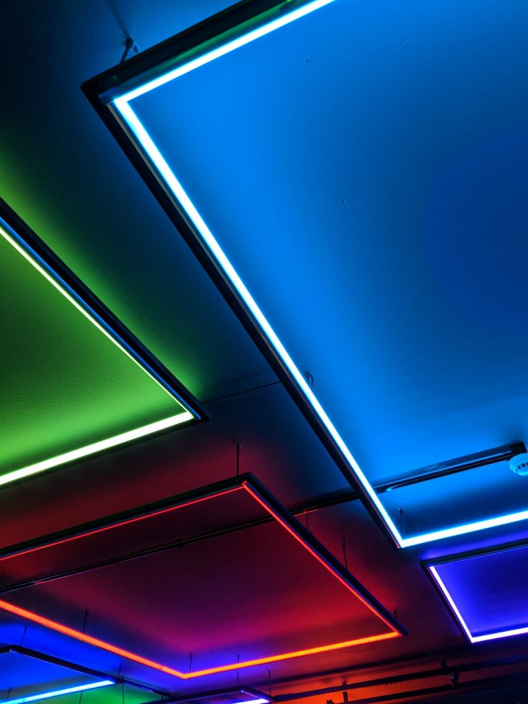
In interior design, neon hues quickly became natural. The interior design industry’s openness to new ideas made it an ideal aspect for neon colors to infiltrate. Designers leaning toward casual, playful, and urban designs get the most out of these bright colors.
The fashion world’s ability to make any trend wearable is also one of the neon colors’ best industry efforts. Neon hues gave life to muted tones—when paired together. Pops of colors give life to rather boring and lifeless designs.
A conclusion on neon colors making navigation easier
When we said navigation, we did not only mean workers by the road and railways wearing high visibility clothing to make themselves appear in the dark. We also touched on navigation ease in the digital space, interior design, and the fashion world. The boldness of these colors gave way to even bolder strides in these industries—and we can always rely on the rise of neon hues to be the guiding principles of these industries when it comes to tackling trends that seem loud and bold.